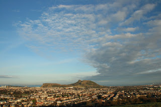
For this project I needed to find a location with an interesting landscape and an unbroken and clear horizon. I went to nearby Blackford Hill which has a nice view over Edinburgh and Arthurs Seat. I had to consider the different locations of the horizons in the frame. Since there was a nice hill sloping down in front of me, I thought it would make an interesting foreground, and then have Arthurs seat in the background. I also saw that there were great clouds gathering in the sky which would make an interesting photo with just a hint of Edinburgh at the bottom. I put on my widest lens at 17mm and the tripod to get a flat horizon.
Photo 1: I started with the horizon at the top, which I think is quite effective. I really like the shadow on the ground, and the grass has some interesting texture.
Photo 2: Horizon now about 1/3 from the top, which means there is some nice blue sky and clouds.
Photo 3: Horizon just above the centre, photo not that interesting...
Photo 4: Horizon just below the centre line. This is more interesting than Photo 3, because the clouds are more interesting than the foreground hill.
Photo 5: The horizon is now about 1/3 from the bottom, I really like the clouds covering the sky and the little bit of foreground, and the sky getting more blue towards the top of the photo.
Photo 6: I think this photo has lost the balance by removing the foreground. There is a lack of depth in this photo compared to the other shots.
Photo 7: I put Arthurs Seat at the bottom of the photo so it's mostly the clouds. I thought this would be really effective, but there is no balance in the shot and little interest apart from the abstract nature of the clouds.
I think Photo 5 is the most interesting, because there is good depth in the photo, and interesting clouds and the horizon is a good position.


For me I like the last one as I really like the clouds and the unconventionally low horizon adds emphasis. On the earlier ones I find the foreground a little too dark to my taste.
ReplyDeleteHey Selina, nice sequence. I think picture 5 is probably the best composition except for the dark shadow at the edge of the built up area, which as Duncan says, is a little dark. For that reason, my favourite is picture 6 - it shows the great detail in the sky, has the horizon just below the 1/3 point, which makes for a strong composition, and the dark area at the edge of the houses has been missed out.
ReplyDelete