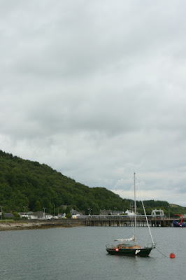
Photo 1: Boat in dead centre of photo. This photo doesn't have any interesting dynamism to it, and is a fairly boring photo as a result.
 |
| From Project_7 |
Photo 2: Here the boat is off to the right, there is an interesting triangular shape to the left, made up of a sloping hillside, and the water has some nice texture to it. This is definately a more interesting photo.
 |
| From Project_7 |
Photo 3: Here the boat is situated in the lower right hand corner of the photo. With an interesting sky, this would make an even stronger photo, but the sky is quite mediocre and therefore there is a bit too much grey cloud, however this is the best photo in the set.
 |
| From Project_7 |
Photo 4: The boat is situated in the left, slightly upper part of the photo. In this photo there is almost no hillside showing, and as a result the photo has a very different feel to the previous photos. The jetty forms more of the background, but there is a bit too much water in the foreground.
 |
| From Project_7 |
Photo 5: The boat is situated in the lower left region of the photo. As with photo 4, there is little hillside, so not as much interest in the background. As with photo 3, the sky is not very interesting so doesn't add much to the photo.
 |
| From Project_7 |
Photo 6: A portrait photo of the same scene, with the boat situated in the upper right quadrant. I think there is too much water in this photo.
 |
| From Project_7 |
Photo 7: Another portrait photo, here with the boat in the lower right quadrant. The boring sky dominates again in this photo.
 |
| From Project_7 |
I think it was most worthwhile to revisit this project and the effect of changing the position of the boat is really quite large!

No comments:
Post a Comment