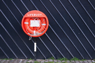
The aim of this project was to choose a really simple scene, with only a few elements, and to carefully choose where the main object was placed relative to the background. I chose a bright red buoy on Edinburgh's canal, where I often walk. The main elements of the photo, and my position doesn't change at all in this series, but where I have placed the lifebuoy is different in each photo, and therefore the relationship between the buoy and fence is different in each photo.
Photo 1: Quickly taken without much thought. It's ok, there is some balance between the buoy and fence.
Photo 2: Dead Centre. The buoy breaks up the photo and there is no continuity of the fence.
Photo 3: I think I prefer this one, as there is a large part of the photo as fence (interesting with the diagonal lines) and then there is the lifebuoy which is bright and clean.
Photo 4: This is the same as photo 3 but with the buoy on the left, which works also but is not quite as good as photo 3 in my opinion.
Photo 5: This one I chose to not include the ground at the bottom, and therefore more of the fence at the top of the photo. I think this unbalances the photo, and is therefore not as good as the other photos.
I like Photo 3 the best because of the large amount of fence which balances nicely with the bright red buoy and the buoy doesn't break up the scene too much but is instead part of the scene.


No comments:
Post a Comment