Those of you living in little old Adelaide, I highly recommend a visit to the SA museum... they have the wildlife photographer of the year winners on display at the moment, yours to see for a mere $5! I would love to go! Don't worry, I think it comes to Edinburgh later in the year so I should manage to see it. The photos are brilliant, I can't decide on my favourite, but they are all beautiful images, very inspiring. The kind of images I can only dream about making...
http://www.samuseum.sa.gov.au/page/default.asp?site=1&id=1967

Friday, 24 April 2009
Thursday, 23 April 2009
Project 22: Curves
Similar to the previous projects, but here the focus is on curves.
Photo 1. This was taken in the Pentlands, near Edinburgh. I thought the gentle rolling hills were beautifully curved and look almost sensual!
 f/3.5, 70mm, 1/125s, ISO200
Photo 2. This photo was taken in Amsterdam and is a subtle curve of trees with a shadow onto the building behind.
 f/5.6, 70mm, 1/100s, ISO400
Photo 3. This photo was taken in Amsterdam, and is a bridge in a modern part of town. I chose a long angle on the handrail and you can see it curving off into the distance, but the main curve is the strange bird like necks sticking out the top of the bridge!
 f/5, 25mm, 1/4000s, ISO400
Photo 4. A bicycle in Amsterdam, with shadow. I thought the wheels both real and shadow looked quite curvy.
 f/4.5, 70mm, 1/1600s, ISO400
Looking here for a sense of smoothness (Photo 1), grace, elegance (Photo 4), of movement, direction (Photo 3 perhaps?)
Photo 1. This was taken in the Pentlands, near Edinburgh. I thought the gentle rolling hills were beautifully curved and look almost sensual!
 f/3.5, 70mm, 1/125s, ISO200
 Photo 2. This photo was taken in Amsterdam and is a subtle curve of trees with a shadow onto the building behind.
 f/5.6, 70mm, 1/100s, ISO400
 Photo 3. This photo was taken in Amsterdam, and is a bridge in a modern part of town. I chose a long angle on the handrail and you can see it curving off into the distance, but the main curve is the strange bird like necks sticking out the top of the bridge!
 f/5, 25mm, 1/4000s, ISO400
 Photo 4. A bicycle in Amsterdam, with shadow. I thought the wheels both real and shadow looked quite curvy.
 f/4.5, 70mm, 1/1600s, ISO400
 Looking here for a sense of smoothness (Photo 1), grace, elegance (Photo 4), of movement, direction (Photo 3 perhaps?)
Wednesday, 22 April 2009
Project 21: Diagonals
Here again I show 4 photographs which use diagonals strongly. I have tried to choose a variety of situations, some with really obvious diagonals and a few a bit more subtle.
Photo 1. This photo was taken in Amsterdam and I was lucky to get this shot with the sun shining (it dissapeared when I went to take a second photo and the shadows went away too!). I like the brick background and the strong diagonal shadows on the wall. The inclusion of the bottom window (with no shadow) adds interest and breaks up the repetition which works really well in this photo.
 f8, 63mm, 1/400s, ISO400
Photo 2. This photo was taken at Roslin, near Edinburgh, and I chose to focus again on the shadows, this time a small pen in a field and a power pole shadow on the ground. I like the slightly grainy film-like quality of the gently diagonal grass in the upper part of this photo.
 f4.5, 40mm, 1/180sec, ISO200
Photo 3. This photo was taken in the lakes district, looking up a valley at a small waterfall and seeing all the other valleys converging from left and right to form a series of diagonal lines. This is quite subtle use of diagonals but I think you can still clearly see the diagonal elements.
 f8, 70mm, 1/500s, ISO400
Photo 4. This photo was taken in Edinburgh (Marchmont). I have taken the photo at an angle which emphasises the diagonals, but because the building is still loosely aligned in the frame it actually lessens the effect of the diagonal. This is interesting... diagonals which still conform to the frame.
 f11, 35mm, 1/60s, ISO400, Tripod
I found using different focal lengths helped to see different diagonals (and other lines etc) when out taking photos for this project.
Monday, 20 April 2009
Project 20: Horizontal & Vertical lines
I have been searching for horizontal & vertical lines for a little while now and have drawn together my small collection. I was to 'try to subordinate the content of the picture to the line', i.e. to make the line the first thing the viewer sees. I have gone with B&W shots again to help this, but it's still quite difficult.
Horizontal Photo 1: This photo was taken looking vertically (almost) up at a funky modern building in Amsterdam. By looking at such a steep angle the building is compressed (even with a fairly wide angle) and the horizontal lines are drawn together, enhancing each other.
 38mm, f/9, 1/250sec, ISO 400, very windy day!
Horizontal Photo 2: This photo was taken the same day, of a modern bridge in Amsterdam. The slats on the bridge are very linear.
 24mm, f/5, 1/1250sec, ISO 400
Horizontal Photo 3: This was taken on a beautiful spring day in the Borders, I was focussing on the linear nature of the water/ground boundary.
 45mm, f/8, 1/250sec, ISO 200
Horizontal Photo 4: This photo was taken in the Lakes District, here I am focussing on the walls and the trees have a nice softening effect on the lines. I like the sheep in the field beyond too.
 70mm, f/9.5, 1/250sec, ISO 400
Vertical Photo 1: This photo is taken near the meadows in Edinburgh, crouched down low on the bike path/ walkway. I like the long linear nature of the white line and lights beyond and just needed to wait for the cyclist to enter the frame at the right place.
 24mm, f/5, 1/4sec, ISO 400, Tripod
Vertical Photo 2: This photo was taken in Amsterdam, just some interesting balconies or something similar on the side of an apartment building. I like the vertical nature of them. I thought about removing the diagonal fire-escape stairs on the left side but thought they balanced the photo and didn't take away from the strong vertical nature of the shot.
 70mm, f/4.5, 1/250sec, ISO 200
Vertical Photo 3: This photo taken in Amsterdam had nice vertical windows and coloured bricks which added to the vertical feel. The two trees in the foreground give this image some depth and added interest (and verticallity).
 35mm, f/13, 1/400sec, ISO 400
Vertical Photo 4: This photo taken in the Lakes District is a simple path with some stepping stones in a roughly vertical format. It is quite a simple image and is similar in nature to the 1st vertical photo but much more subtle.
 17mm, f/5.6, 1/180sec, ISO 400
I find it interesting that the 4 horizontal shots were all landscape orientation, and my 4 vertical shots were all portrait in orientation. I should have tried to break this mould... so here I have very quickly cropped two photos to see how they look in the other orientation.
Horizontal Photo 4 (alternative crop): I think this still works quite well and does still have quite a strong horizontal feel to it.

Vertical Photo 3 (alternative crop): I don't feel this photo works as well in this format.

Once I started looking I did find it easier to see horizontal & vertical lines.
Horizontal Photo 1: This photo was taken looking vertically (almost) up at a funky modern building in Amsterdam. By looking at such a steep angle the building is compressed (even with a fairly wide angle) and the horizontal lines are drawn together, enhancing each other.
 38mm, f/9, 1/250sec, ISO 400, very windy day!
Horizontal Photo 2: This photo was taken the same day, of a modern bridge in Amsterdam. The slats on the bridge are very linear.
 24mm, f/5, 1/1250sec, ISO 400
Horizontal Photo 3: This was taken on a beautiful spring day in the Borders, I was focussing on the linear nature of the water/ground boundary.
 45mm, f/8, 1/250sec, ISO 200
 70mm, f/9.5, 1/250sec, ISO 400
Vertical Photo 1: This photo is taken near the meadows in Edinburgh, crouched down low on the bike path/ walkway. I like the long linear nature of the white line and lights beyond and just needed to wait for the cyclist to enter the frame at the right place.
 24mm, f/5, 1/4sec, ISO 400, Tripod
Vertical Photo 2: This photo was taken in Amsterdam, just some interesting balconies or something similar on the side of an apartment building. I like the vertical nature of them. I thought about removing the diagonal fire-escape stairs on the left side but thought they balanced the photo and didn't take away from the strong vertical nature of the shot.
 70mm, f/4.5, 1/250sec, ISO 200
Vertical Photo 3: This photo taken in Amsterdam had nice vertical windows and coloured bricks which added to the vertical feel. The two trees in the foreground give this image some depth and added interest (and verticallity).
 35mm, f/13, 1/400sec, ISO 400
Vertical Photo 4: This photo taken in the Lakes District is a simple path with some stepping stones in a roughly vertical format. It is quite a simple image and is similar in nature to the 1st vertical photo but much more subtle.
 17mm, f/5.6, 1/180sec, ISO 400
I find it interesting that the 4 horizontal shots were all landscape orientation, and my 4 vertical shots were all portrait in orientation. I should have tried to break this mould... so here I have very quickly cropped two photos to see how they look in the other orientation.
Horizontal Photo 4 (alternative crop): I think this still works quite well and does still have quite a strong horizontal feel to it.

Vertical Photo 3 (alternative crop): I don't feel this photo works as well in this format.

Once I started looking I did find it easier to see horizontal & vertical lines.
Thursday, 16 April 2009
Project 19: Multiple Points
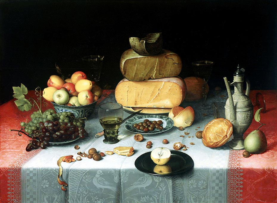
The basis of this project is a still-life setup, so I am briefly going to mention two lovely still-life paintings I saw recently in the Rijksmuseum in Amsterdam that I really liked. The first is Floris van Dijck, 1615 painting which shows lovely use of light, shadows, reflections. The cut apple at the front looks like you could reach out and touch it! The peel falling off the edge of the table forms a subtle line with nut shells and nuts and at the end a fallen-over glass in the shadows. The general shape of the painiting is triangular, with the apex at the top of the pile of cheeses. Here is a link to an image of the painting.
The second painting I liked was Wilhem Claesz Heda, 1635, still life of oysters on a plate, shells, wine goblets and jugs of all shapes and sizes. The tablecloth is scrunched up and almost iredescent looking. The painting is also triangular in shape, though a lopsided triangle, created mainly by the various jugs & goblets, and one which is tipped over helps move the eye through the painting. The highlight of this image is the half-peeled lemon which is hanging over the edge of the table - a splash of colour and beautifully painted too. Here is a link to an image of the painting.
My own still life attempt here is naturally going to be a little simpler than those mentioned above! I decided to use some fresh vegetables on a simple tablecloth on our table. I set up my camera with quite a wide angle to take in most of the table, with a bit of the edges showing, possibly not quite ideal but ok for the project at hand. I set the camera to b&w and I found it really helped with my analysis of the images while I was shooting - easier than looking at the coloured objects on the table. The shapes and patterns started appearing as soon as I placed the vegetables on the table. The brief said to "avoid regular shapes" but I found this difficult because the eye is naturally drawn to regular shapes, anyway, I tried to make it look interesting. It was amazing to see how minor changes could influence the look of the image so strongly. I took about 35 photos but have selected just 9 to write up here.
Photo 1: A leek and pepper on a table... looks like an implied triangle, with the base of the table forming the base of the triangle.

Photo 2: Oh I like this one... the Kholarabri (middle) looks like a lady crossing her (many) legs! The rest of the setup isn't terribly interesting at this point.

Photo 3: Moved the larger object (Kholarabri) back, and the tomato forward. There is still an implied triangle but also some tension between the garlic and tomato (they are both small point-like objects and I really see a strong line between them in this image).

Photo 4: A bit busy. The garlic and onion are very close together , the pepper and zuccheni align to continue the triangle theme. Not much structure though in this shot, it is starting to look a bit crowded.

Photo 5: A bit of rearranging results in a some clearer shapes, or groupings of shapes. The kholarabri is too much, with its foilage, so I will remove that. The three small long things are a bit all together, too much reinforment of a line. The sweet potato, garlic & onion are just a bit random on the edge.

Photo 6: Potato replaces kholarabri and struggles to fill the space.

Photo 7: A semi-circle centered around the potato is formed but the pepper joining up with the zuccheni (courgette). The onion, carrot & garlic are forming a little triangle at the front centre, and the right hand side still needs some adjusting.

Photo 8: I adjusted the front triangle slightly to point the onion around to help with the triangle, moved the garlic closer to the edge of the table (to emphasise it a bit more, I love garlic), and adjusted the carrot slightly too. I also gave the RHS a bit more space by moving the sweet potato back, but I feel as a whole the group has not come together quite right yet.

Photo 9: The finished masterpiece! I removed the sweet potato as it wasn't adding much, and decided to make the leek the real apex of the image by pushing it further to the top of the photo, and giving a little more space for our small triange at the front. The right pepper and tomato align to form a line and also the side of the large triangle, the semi-circle is smoothly round and is centered on the potato without it being pushed to the edge. The small triangle at the front is not perfectly arranged hence keeping some interest there. All in all I like it! I think this meets the brief of being a group which hangs together visually but is not too obvious.

Sketch: An attempt to show some of the lines that relate the objects and some of the basic shapes that are formed. Triangles mostly, but also the semicircle pulling in to the potato.

An interesting project which has kept me amused for the whole evening! It was fun to try a still-life set up and move the various objects around to see the effect. I can see how people started making flicker movies by just moving one small thing at a time, my vegetables look almost alive when I flick through all the shots taken! I think the end photo is quite interesting but not too obvious, though I did have some of it vaguely in mind before I started.
Wednesday, 15 April 2009
Project 18: Relationship between points
This project had the brief to take photos without preconceptions of naturally occurring pairs of points. I have taken 'points' quite loosely in these photos. They also needed to be widely spaced in the frame.
Photo 1: More lambs! This time two in the bottom LH corner and another pair disappearing out the top RH corner. The eye is drawn to look at one pair and then the other. The placement of each point is quite extreme in the frame and does result in a large blank area in-between. Had I had more time I might have decreased this a bit, but as they were running away from us (we were behind a fence) I had little time! I didn't want to include the mother with the RH pair which is why it is cropped so close there. The front pair is the more dominant, mostly because of their larger size in the frame, but also because they are closer to the 'front' of the photo. Here the implied line is strongly diagonal across the photo, and the direction towards the lower left.
 67mm, f/8, 1/125sec, ISO200
Photo 2: A tower and a tree. The tree is right on the edge of the frame, but has some 'bulk' to it, which makes it a strong point. The tower is about a quarter from the RH edge, and is a strong, vertical, solid mass. It probably has slightly stronger pull of attention, partly because it is closer to the centre, but also because of its solidity. The implied line is looser here (as the points are less point-like), but is from the centre of the tree to the centre of the tower roughly. The movement direction is not so clear as the first photo.
 34mm, f/11, 1/20sec, ISO100
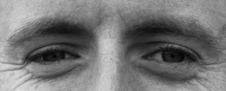
Photo 3: The other task for this project was a close up of a face just zooming in on the eyes, to look for tension that is unresolved in a photo of two points. I'm not really sure this works or not in this photo? I will be interested to look for other (less posed) examples of this tension from now on. The implied line is horizontal, and the movement is bi-directional.
 70mm (cropped in later), f/8, 1/125, ISO200
Photo 1: More lambs! This time two in the bottom LH corner and another pair disappearing out the top RH corner. The eye is drawn to look at one pair and then the other. The placement of each point is quite extreme in the frame and does result in a large blank area in-between. Had I had more time I might have decreased this a bit, but as they were running away from us (we were behind a fence) I had little time! I didn't want to include the mother with the RH pair which is why it is cropped so close there. The front pair is the more dominant, mostly because of their larger size in the frame, but also because they are closer to the 'front' of the photo. Here the implied line is strongly diagonal across the photo, and the direction towards the lower left.
 67mm, f/8, 1/125sec, ISO200
Photo 2: A tower and a tree. The tree is right on the edge of the frame, but has some 'bulk' to it, which makes it a strong point. The tower is about a quarter from the RH edge, and is a strong, vertical, solid mass. It probably has slightly stronger pull of attention, partly because it is closer to the centre, but also because of its solidity. The implied line is looser here (as the points are less point-like), but is from the centre of the tree to the centre of the tower roughly. The movement direction is not so clear as the first photo.
 34mm, f/11, 1/20sec, ISO100
Photo 3: The other task for this project was a close up of a face just zooming in on the eyes, to look for tension that is unresolved in a photo of two points. I'm not really sure this works or not in this photo? I will be interested to look for other (less posed) examples of this tension from now on. The implied line is horizontal, and the movement is bi-directional.
 70mm (cropped in later), f/8, 1/125, ISO200
Project 16: Points
Firstly, I had to think about situations that would result in a single point in the frame... here are some ideas...
- boat against water (the most obvious?)
- balloon in the sky
- moon & sky
- torch against a dark background (not sure how this would work)
- round hay-bale against a field
- bird flying
- rock/shoe/ball/object on the beach
- bright tent on subdued hillside (colour accent not point?)
- cow in a large field
- an island in the ocean (from above)
- one flower on a bush/tree
- one skiier on a slope
Secondly, to choose photos in my photo library which have a single point, whether mine or from a magazine or something. Due to possible copyright issues I'll only put my photos up here, and I have a few more from magazines in my paper (b)log...
Here are some examples which I meant to post before Project 17, but didn't get around to it! I have chosen to do this series of projects in black and white to avoid having colour influence my feelings about the design elements.
The first photo of a bird against the sky is just off centre.

The hole in the ice is a negative type point, and it is quite off-centre, because of the snow filling the other portion of the frame to create a balance. And I just noticed the implied line caused by the hole in the ice, with the two blobs lower-middle and lower-right, which parallels nicely with the snow line on the ice.

The tomato (from my Assignment) has a nice strong point where the stalk would join, it is fairly strongly off centre, and almost forms a golden section spiral?

The telemark skiier with the moguls is a small point in the frame, horizontally centred but vertically well offset to the left.

The house is placed strongly lower-left and the rest of the frame filled with the snow-covered mountains.

Tuesday, 14 April 2009
Project 17: Positioning a point
This project is similar to Project 7, but now we needed to find 3 points and position them carefully in the frame, with reason behind the placement. I decided to shoot in b&w as I found I was easily drawn to colour accent instead of points that stand out due to their form.
Now I had to compare these with others in my photo library and think about the graphic relationship. Having one point in a photo makes for a relatively uniteresting photo. There is little dynamism apart from perhaps some interest between the point and the background. The sense of movement I feel is related to what might be happenning in the photo - where the wind is blowing, the lamb is looking and the boat is moving. Drawing lines through the point does help to break up the frame, but this seems to be quite loose with just one point, however it will be stronger with multiple points.
Photo 1: A plastic bag floating in water. In the b&w the ripples stand out strongly and the plastic bag is subtle but pale (a bit ghostly), but still stands out as a point. I looked at the direction of the ripples and placed the bag so that it can 'move' across the frame following the direction that the wind appears to be going in. 70mm, f/9, 1/250sec, ISO400
 70mm, f/9, 1/250sec, ISO400
Photo 2: Lamb in the field. Here the lamb seems all alone and everything appears still. I have placed it top left because it is looking towards the lower rhs of the frame, and there is a big open grassy space there. The grass on the left of the frame seems to either detract or help fill in the space, I'm not yet decided. The b&w works well here because the white lamb stands out so well against the slightly darker green grass.  100mm, f/4.5, 1/250sec, ISO200
 100mm, f/4.5, 1/250sec, ISO200
Photo 3: I decided to use the classic 'boat on water' photo taken at Ullswater in the Lakes District. Here the boat is brilliant white (sails) and the background mottled greys, which means it stands out well. There is approximately equal amounts of sky and water, balanced by the hills in between. The boat is in the lower 1/3 of the frame and is moving towards the open space on the right of the photo.  42mm, f/13, 1/60sec, ISO200
 42mm, f/13, 1/60sec, ISO200
Now I had to compare these with others in my photo library and think about the graphic relationship. Having one point in a photo makes for a relatively uniteresting photo. There is little dynamism apart from perhaps some interest between the point and the background. The sense of movement I feel is related to what might be happenning in the photo - where the wind is blowing, the lamb is looking and the boat is moving. Drawing lines through the point does help to break up the frame, but this seems to be quite loose with just one point, however it will be stronger with multiple points.
Subscribe to:
Posts (Atom)